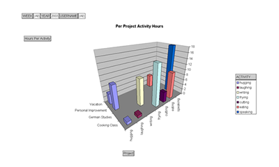
It is easy to use MS Excel to analyze work hours in a number of ways.
The chart below shows four projects and for each project it shows the
number of hours spent on each activity.

The data was extracted from the TIMETOWORK database using a live connection
between Excel and the database. It can be refreshed with the push of
a single button.
This particular chart was created using what is called a pivot chart.
A pivot chart enables the user to analyze the data using a number variables
(or dimensions). In this particular case the chart enables it's user
to set five variables to perform the analysis.
- week number of year
- year
- employee
- activity
- project
For example the above chart was created using the following variable
settings: all employees, all weeks, the year 2003, all activities, and
all projects.